Japanese Paradise Flycatcher

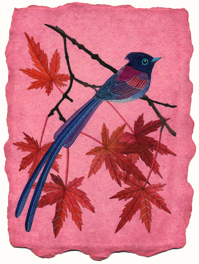
Nothing subtle about this one :p
This is the sheet I dyed with jamaica petals. A little too pink for my personal taste. What do you think?
Watercolor & acrylic ink. 6" x 8"
Inspired by this photo by John Soong, my favorite bird photographer.
If you love birds like me you must check out his Flickr stream.


Well, I'm not usually fond of pink, but I find this nuance quite suited for that marvellous bird.
Hugs from rainy Italy!
Gio
This comment has been removed by the author.
Outstanding! Colors in this one are my favorite. I'm totally inspired to make jewelry in this color palette now!! Awesome G!
Lovely! I absolutely love the colours of the bird, the pink compliments it so well!
Wow! I usually wouldn't go NEAR anything pink, but this really works. And I am absolutely taken with this little bird. I wish we had them around here (for my bird-obsessed self)!
I must admit that the coffee-stained paper is still my favourite, but it's always great to mix things up a bit!
If you don't like it, please send it my way! I'm currently living in Japan and would love one of your pieces!
:)
Emily
It works because the bird is painted with such strong colors.
Hm, too pink or less pink? - it doesn't matter. It looks very good alltogether and that's what counts!
Thanks for sharing John Soong's stream! So inspiring and beautiful!
Absolutely beautiful! The pink is very pink indeed, but it gives a warm mood to your gorgeous work. I may have to snag a copy from your shop if you decide to share...
Actually, I LOVE this piece! The pink is brilliant...vibrant... love it.
So beautiful, as usual!!! I thank you for the link to John Fish stream! Amazing!
I don't usually like pink either but I think with the bird you picked, it is a really great contrast to the blue! And it's so rich (the pink), I can never get fabric/watercolor paper to get that rich when I use tea or coffee! Great job :)
I think it's beautiful!
Very pink indeed but I love it.
I've been following your blog by RSS for some time now and am always blown away by your stunning work!
This is one of my favorites, I love the bright colors and the purple especially!!
your artwork is exquisite....i love to visit and see what you draw up next. cindy
Geninne this is stunning and the pink works so well!
It's pink! And I like it.
I love the pink - it's such a great contrast to the blue of the bird.
Lovely...Pink rules!
Well, it IS a bit TOO pink for my taste, but the fact that you made something so beautiful even whith that much pink is just one more proof of how talented you are :)
It is gorgeous! And, like you, I'm never the pinkest of gals....
It is absolutely lovely! It works well with the other colors.
Although too dark I love it as it is so different and it definitely matches my bedroom walls!Ariadne from Greece!
This is stunning! (like his photo) All of your work is beautiful!
Corinna
Love the pink. All your creations work for me!
The colors just jump! I love it. Very different from your usual work is good every now and then. This is a favorite!
I think it works. That bird is just beautiful!
I'm all about bold and I think it is beautiful (as usual).
Yeah, paper is a bit too pink for me but the painting is gorgeous! For unbelievable bird photos, please visit http://flickriver.com/groups/birdwatching/pool/interesting/
For exotic birds, visit http://www.nebrazilbirding.com/
lovely! The colours are beautiful!
Really pink for me too, but it works well againts the blue colors of the bird. Gorgeous work as usual...
This is stunning! I like the pink - it does complement the other colors so well.
Oh WOW. Pink TOTALLY works! I gotta say, pink is one of my least favorite colors, but this is probably one of my favorite pieces by you now. *biggest internet high-five* :-D
I love your work and this piece is no exception - the green tea paper is SO nice.
Can't wait to see what you come up with next.
Con que razón es tú favorito! Que belleza Geninne! Seguro y él mira tú arte, vas a ser su favorita!
Saludos!
Ale
woow,wonderful work,
wonderful colours,
and papers,Geninne.:))
Gennine, pink is my favourite colour - but not with this bird. If you wish to bring out how tiny the bird is and what beauty its feathers, it is simply a little bit too strong.
Artistically you have made use of blue and orangy/purple contrasts between feathers and leaves, which in the end balances it of quite well.
Wouldn't like to leave without thanking you for your wonderful work which brings a lot of sunshine and happiness to me every day!
Regards
Claudia
i really love your art work. you give lot of idea for my assigmnt. btw, im form malaysia :D nice to know you :D
Hi!
I just found your blog.....I am overwhelmed with the beauty of your artwork.
Please how do I learn to draw the birds?
Does the pink stay like that forever? I tried using beet juice as paint once and the color lasted for almost a year and then faded.
Coffee seemed to work pretty well though
What a TRUE ARTIST you are!!! I just found your blog and am soooooooooooo impressed!!!
Wow, geninne, this one is WONDERFUL! I believe that it is the best drawing that you have done
it outsourcing services | software development company | java web development